
Translation is one check. Layout is another.
A producer preparing the next language version of an end card has two decisions to make: whether the wording expresses the intended action, and whether that wording reads clearly in the composition. A string replacement may be enough. The useful question is whether this particular layout has room for this particular label.
Read the three states
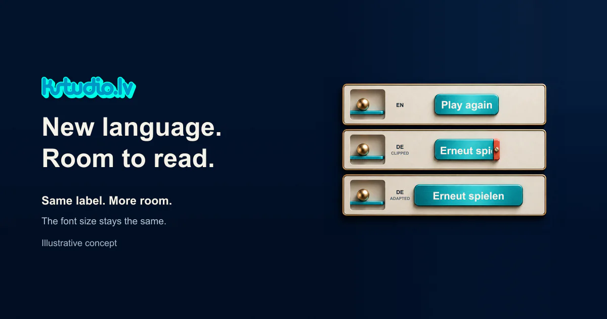
The three states in our illustration make the layout check visible. “Play again” becomes “Erneut spielen” for the same replay action. The middle version deliberately limits the text area, cutting off the end of the German label. The bottom version gives the full label more room while keeping the type size unchanged.
This is our own AI made teaching illustration, with the labels set separately. The clipping is a constructed example. It is not a screenshot from a client’s game or a record of a campaign result.
The production choice shown here is to accommodate the wording before deciding it needs smaller type. A wider button takes space from the surrounding composition, so the check does not end when the last letter becomes visible. Look at the relationship between the button, the nearby image and any competing text.
Check the actual wording
There is no single expansion rule to apply to every language. W3C’s guidance on text size in translation explains that translated text can occupy different amounts of space and recommends layouts that can accommodate those changes.
For a real project, use the wording approved for that game and action. Do not silently shorten a label to solve a layout problem. If the wording needs to change, return it to whoever owns language approval, then check the revised label in the composition.
KSTUDIO’s production adaptation role can cover the layout around those approved strings. The required work might be small, and an existing layout that already fits does not need a redesign simply because the language changed.
Make a small acceptance decision
View the next language version at its intended display size and check three things:
Can you read the complete action without guessing a missing word?
Is there visible space around the label?
Can you find the button easily within the composition?
If all three pass, keep the layout. If one fails, identify that specific area for adaptation. If the action itself is unclear, resolve the wording first.
This check concerns the presentation of the label. It does not establish cultural fit, accessibility compliance or campaign performance. It gives the producer a narrower result: whether this end card needs a layout adjustment before the next approval.
Comments (0)
Awaiting moderation. Only you can see this.